SEVEN CORNERS
New web + product config for travel insurance leader
About
Create new mobile-first product configuration and website design revise for travel insurance
Role
Lead Designer
Skills
Information architecture, wireframes and high-fidelity mockups

Problem
Seven Corners offers one of the most customizable travel insurance portfolios in the market — covering everything from trip protection and travel medical plans to cruise insurance and expat coverage. That flexibility is a strength, but it came with a real usability problem. The range of products, coverage options, and eligibility rules — which vary by destination country, country of origin, and the traveler's home state — made it genuinely difficult for customers to find and configure the right plan on their own. The result was friction at the worst possible moment, and a heavy reliance on inbound calls to licensed agents just to complete a purchase.

Solution
Seven Corners' product complexity wasn't a problem to be eliminated — it was a reflection of how thoroughly their coverage could be tailored to any traveler's situation. The design challenge was to honor that complexity on the backend while completely hiding it from the user. And increasingly, that user was on their phone. With more travelers researching and purchasing insurance on mobile devices, a configuration process that was difficult to navigate on desktop became nearly impossible on a small screen. Our approach worked across two tracks simultaneously: refreshing the brand experience across the full site, and rethinking the product configuration process from the ground up — with mobile as the primary design target, not an afterthought.
solution
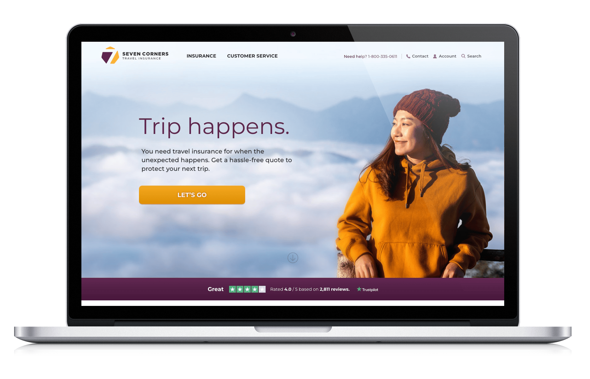
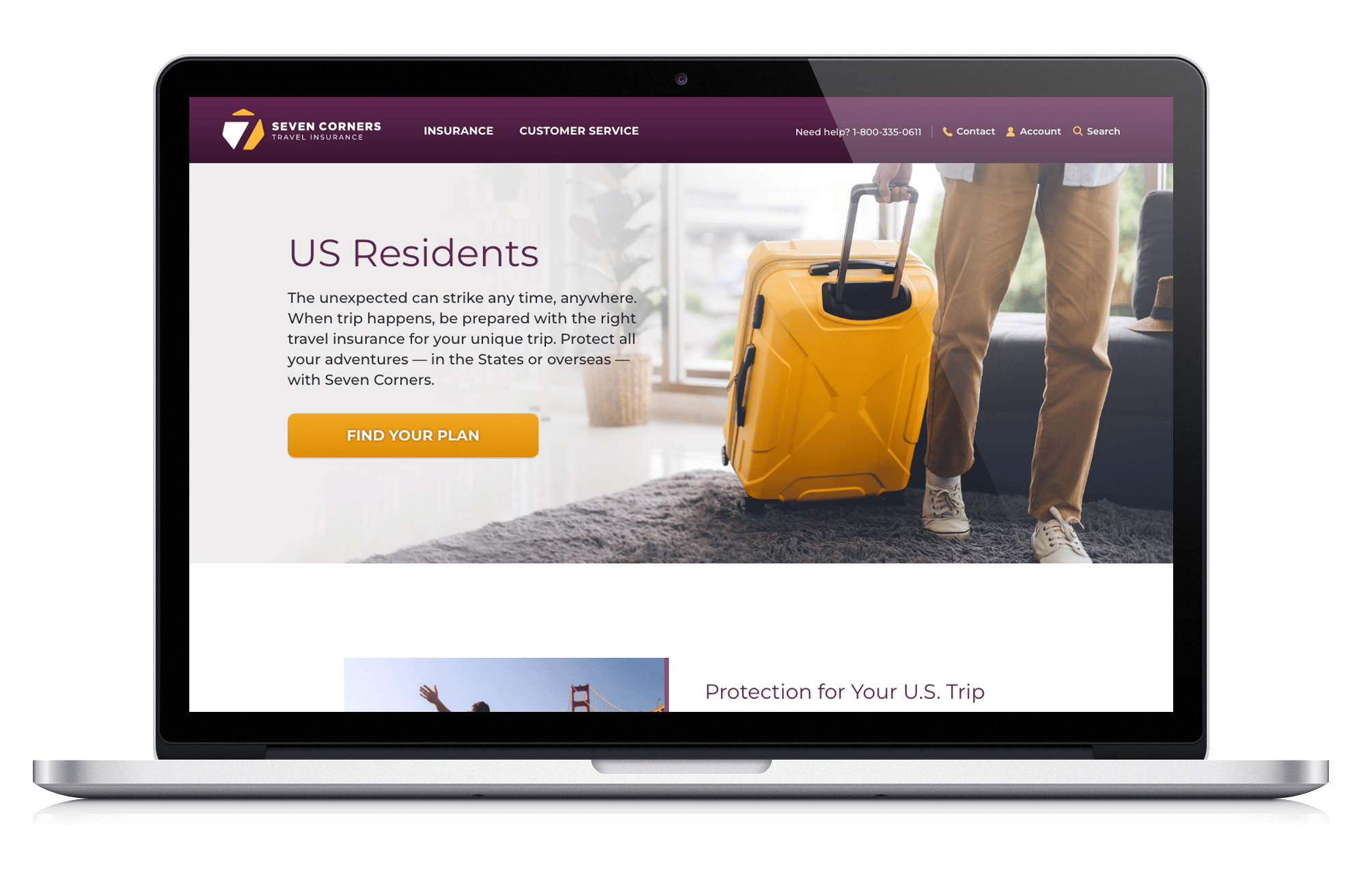
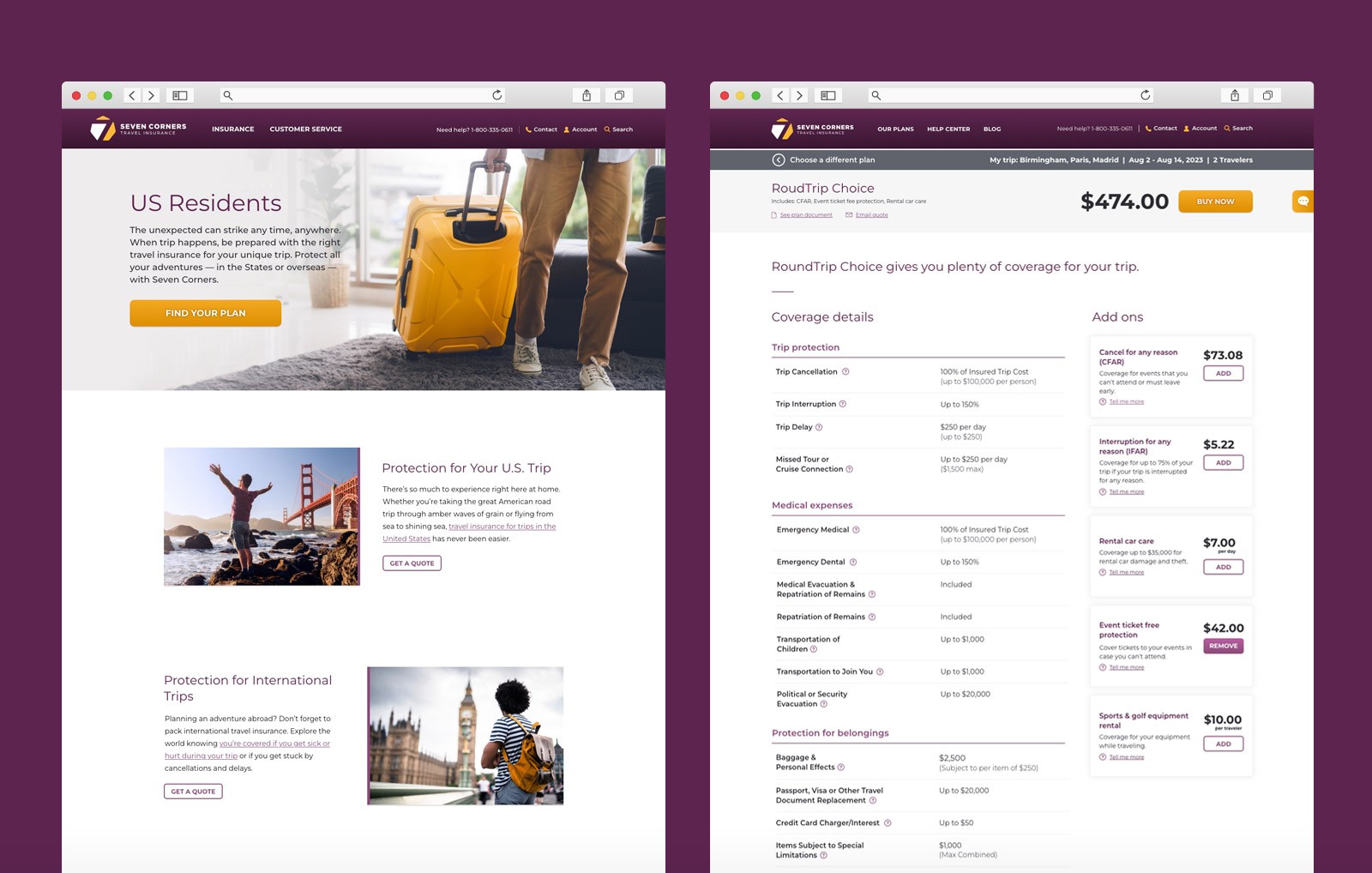
Brand-aligned redesign
The engagement began with a full website redesign tied to Seven Corners' new brand initiative. Every aspect of the visual experience was updated to reflect the refreshed brand — creating a more modern, trustworthy presence that matched the quality and credibility of their coverage.
solution
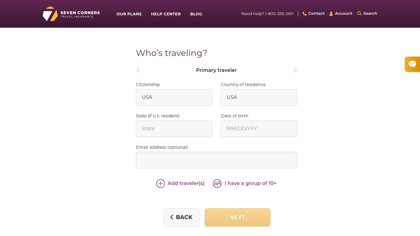
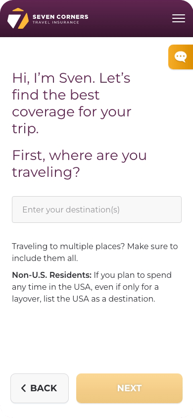
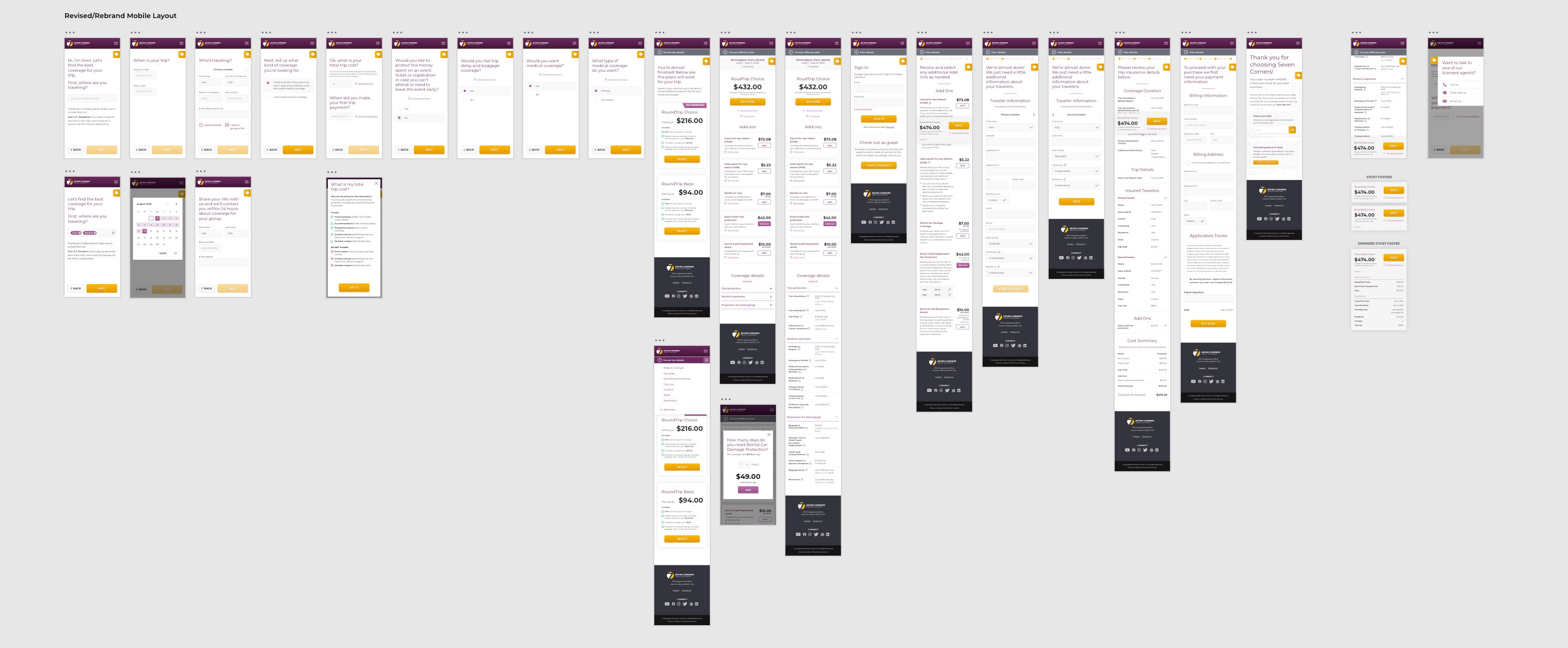
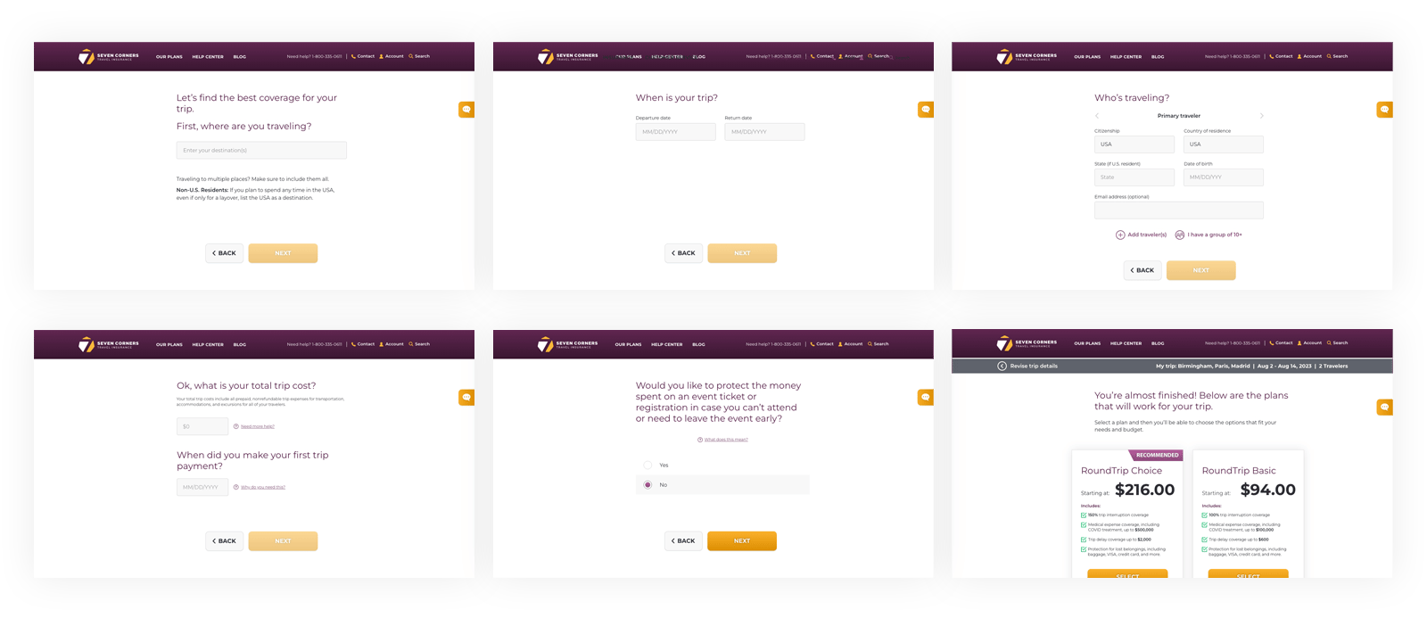
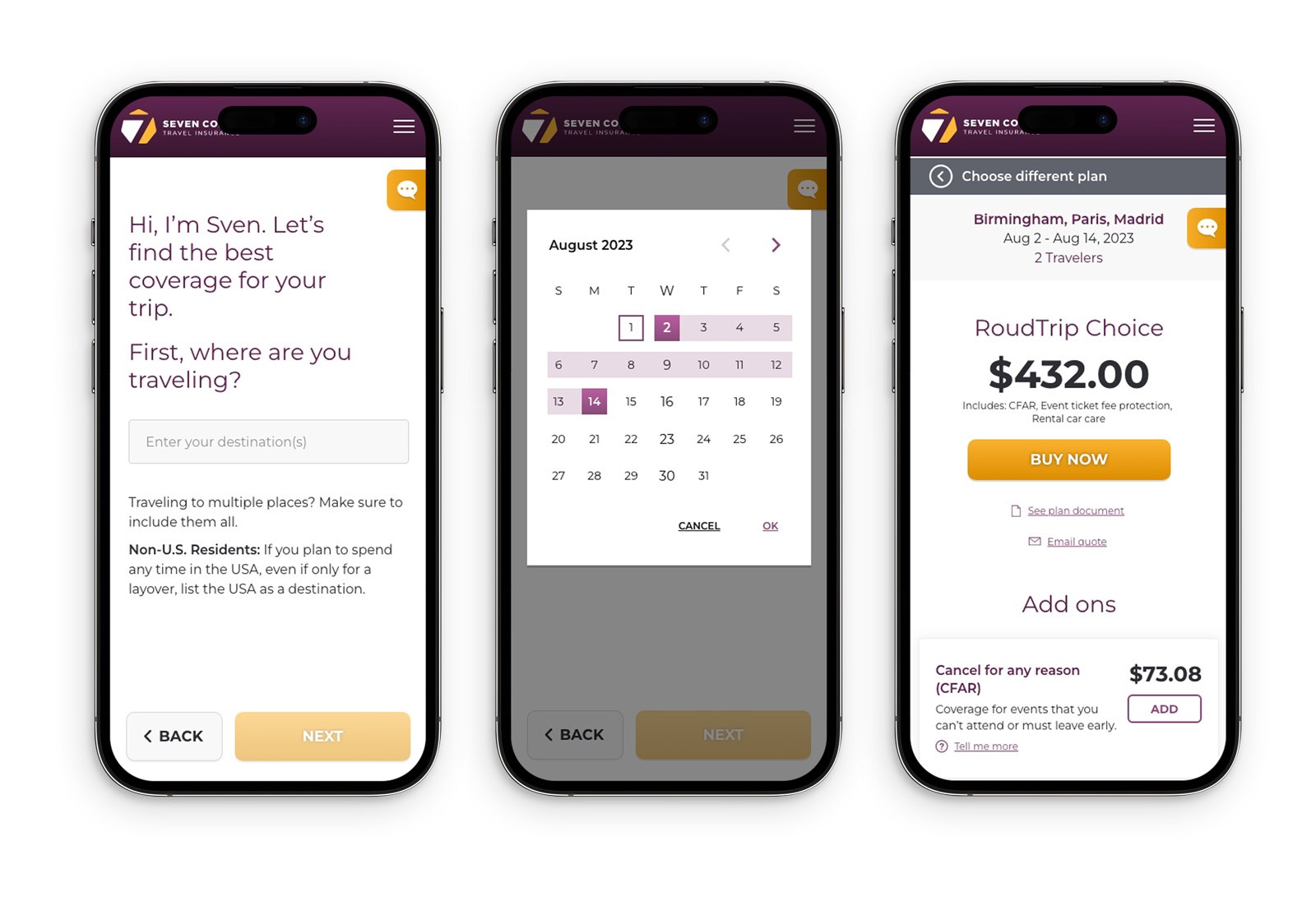
Wizard-style product builder
The centerpiece of the project was a reimagined product configuration tool. We replaced a complex, open-ended selection process with a guided wizard that walked users through a structured series of questions — narrowing options intelligently based on their answers. Where they were traveling, where they were traveling from, and what state they called home all shaped which products and coverage options were available to them. Rather than exposing users to the full complexity of the underlying rules, the wizard surfaced only the choices that were relevant to their specific situation.
solution
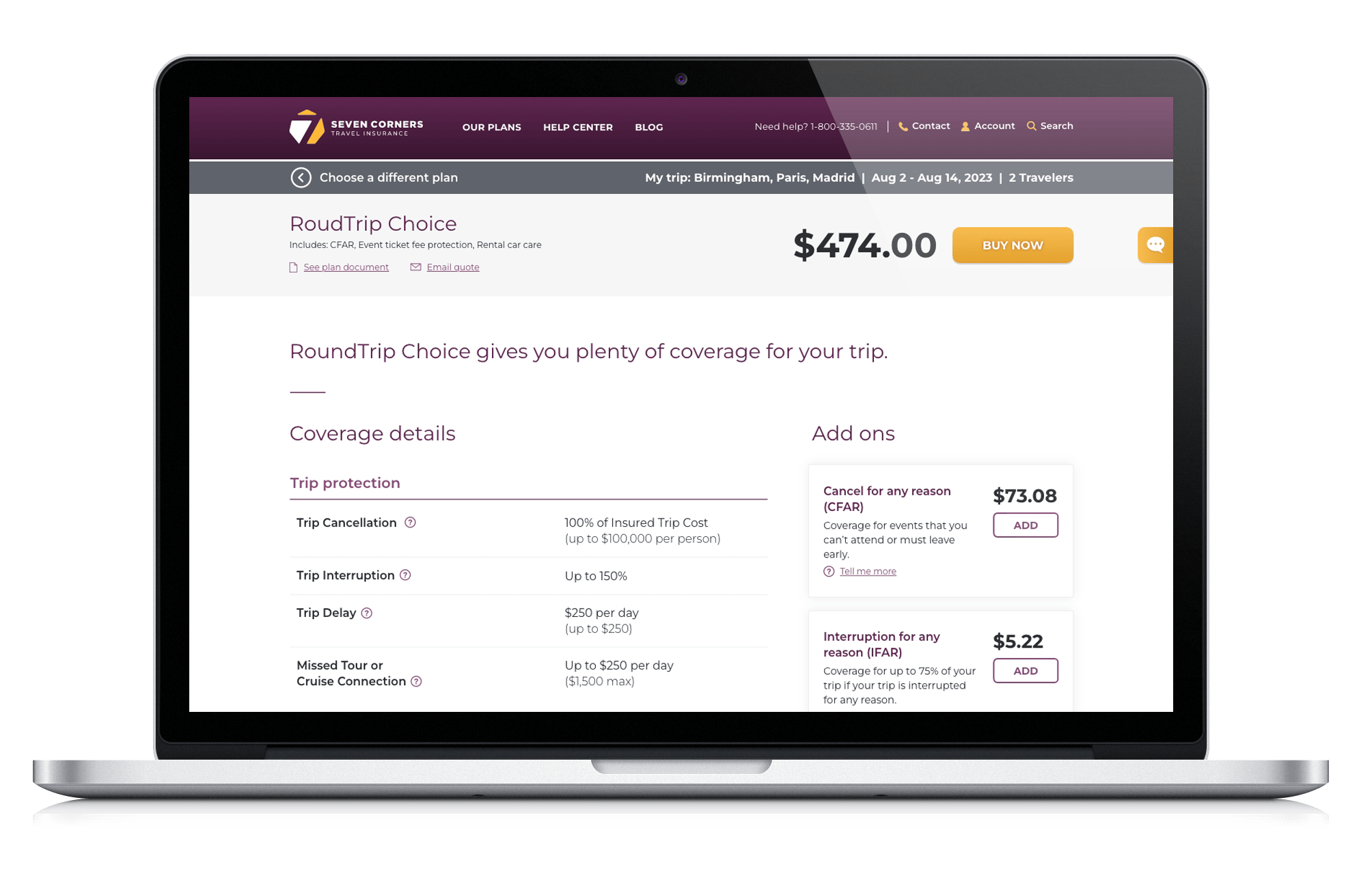
Streamlined quote + checkout
The end goal was a seamless path from configuration to purchase. By guiding users to an accurate, personalized quote without requiring them to understand the underlying eligibility rules themselves, we dramatically reduced the need to call in for assistance — turning what had been a high-friction, agent-dependent process into one customers could complete entirely on their own.
The outcome
The redesign gave Seven Corners a digital presence aligned with their evolved brand, while the new product builder transformed the most complex part of their customer experience into one of the most intuitive. Users could arrive with nothing more than a destination and a travel date and leave with a policy that fit their needs — accurately configured, clearly priced, and purchased without ever picking up the phone.

Brad Wolf | Consultant Portfolio
SEVEN CORNERS
New web + product config for travel insurance leader
About
Create new mobile-first product configuration and website design revise for travel insurance
Role
Lead Designer
Skills
Information architecture, wireframes and high-fidelity mockups

Problem
Seven Corners offers one of the most customizable travel insurance portfolios in the market — covering everything from trip protection and travel medical plans to cruise insurance and expat coverage. That flexibility is a strength, but it came with a real usability problem. The range of products, coverage options, and eligibility rules — which vary by destination country, country of origin, and the traveler's home state — made it genuinely difficult for customers to find and configure the right plan on their own. The result was friction at the worst possible moment, and a heavy reliance on inbound calls to licensed agents just to complete a purchase.
Solution
Seven Corners' product complexity wasn't a problem to be eliminated — it was a reflection of how thoroughly their coverage could be tailored to any traveler's situation. The design challenge was to honor that complexity on the backend while completely hiding it from the user. And increasingly, that user was on their phone. With more travelers researching and purchasing insurance on mobile devices, a configuration process that was difficult to navigate on desktop became nearly impossible on a small screen. Our approach worked across two tracks simultaneously: refreshing the brand experience across the full site, and rethinking the product configuration process from the ground up — with mobile as the primary design target, not an afterthought.
solution
Brand-aligned redesign
The engagement began with a full website redesign tied to Seven Corners' new brand initiative. Every aspect of the visual experience was updated to reflect the refreshed brand — creating a more modern, trustworthy presence that matched the quality and credibility of their coverage.
solution
Wizard-style product builder
The centerpiece of the project was a reimagined product configuration tool. We replaced a complex, open-ended selection process with a guided wizard that walked users through a structured series of questions — narrowing options intelligently based on their answers. Where they were traveling, where they were traveling from, and what state they called home all shaped which products and coverage options were available to them. Rather than exposing users to the full complexity of the underlying rules, the wizard surfaced only the choices that were relevant to their specific situation.
solution
Streamlined quote + checkout
The end goal was a seamless path from configuration to purchase. By guiding users to an accurate, personalized quote without requiring them to understand the underlying eligibility rules themselves, we dramatically reduced the need to call in for assistance — turning what had been a high-friction, agent-dependent process into one customers could complete entirely on their own.
The outcome
The redesign gave Seven Corners a digital presence aligned with their evolved brand, while the new product builder transformed the most complex part of their customer experience into one of the most intuitive. Users could arrive with nothing more than a destination and a travel date and leave with a policy that fit their needs — accurately configured, clearly priced, and purchased without ever picking up the phone.